Viettel Post is Vietnam's leading delivery platform, serving millions of personal and business users through a nationwide logistics network. Despite its scale, the mobile app had become a friction point. It was overloaded with content, inconsistent in its flows, and built without a clear distinction between its two very different user types.
Role
Co-Lead Product Designer
Team of 6 designers
Responsibility
Phase 1:
Competitive & user research (reviews, feedback)
Led UX team: IA redesign & flow optimization
Persona-based design (personal/SME segments)
High-fidelity UI design & visual direction

Problem
The app had grown by addition, never by intention. News feeds, promotional banners, and mini games competed for attention the moment users logged in. The actions people actually came to do book a delivery, track a package, manage COD were buried under layers of content that served the business, not the user.
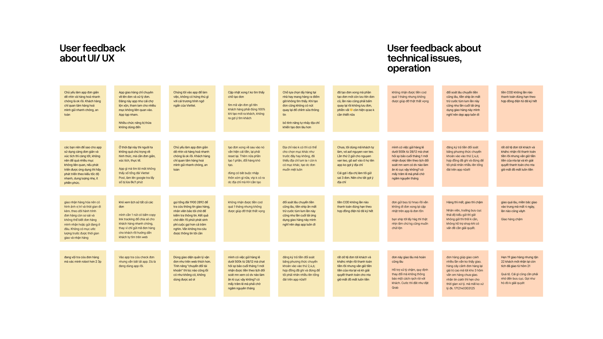
User feedback across digital touch points confirmed what the screen showed: people couldn’t find what they came to do, and when they found it, the flow made it harder than it needed to be.
Research Approaches
With a one month Phase 1 deadline, we prioritized speed without skipping signal. The team analyzed user reviews and feedback across Viettel Post's digital touch points to identify recurring pain patterns.
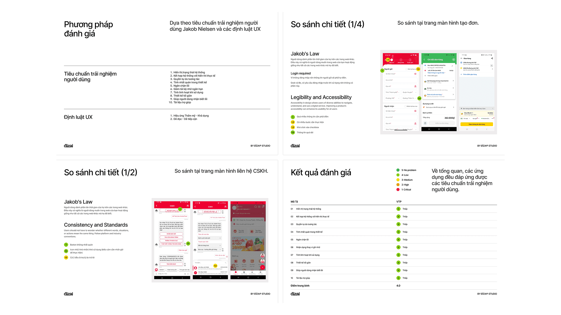
Competitive analysis of GHTK, J&T, Grab, and Shopee helped benchmark what modern mobile delivery UX looked like and where Viettel Post had fallen behind. We used card sorting to validate the new IA structure and heuristic evaluation to audit the existing app against usability principles before making structural decisions.
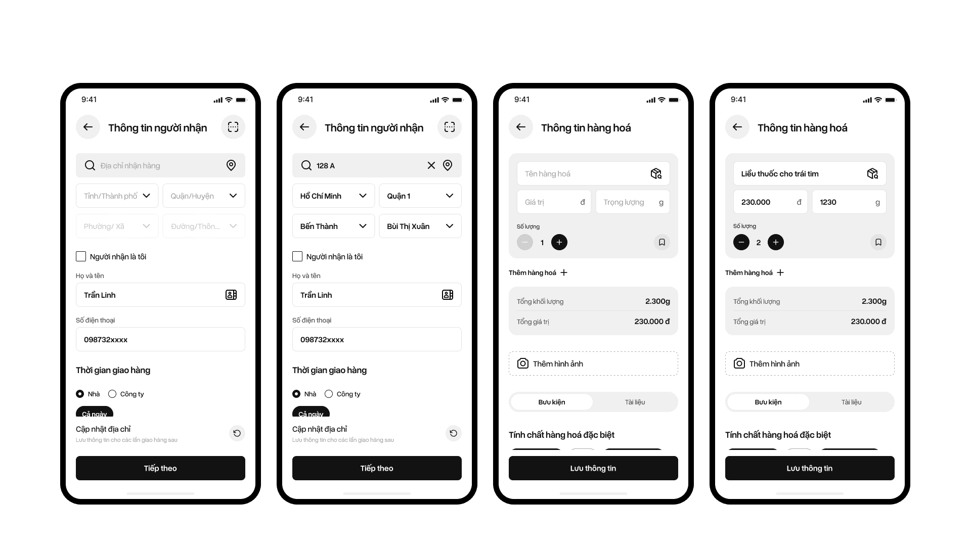
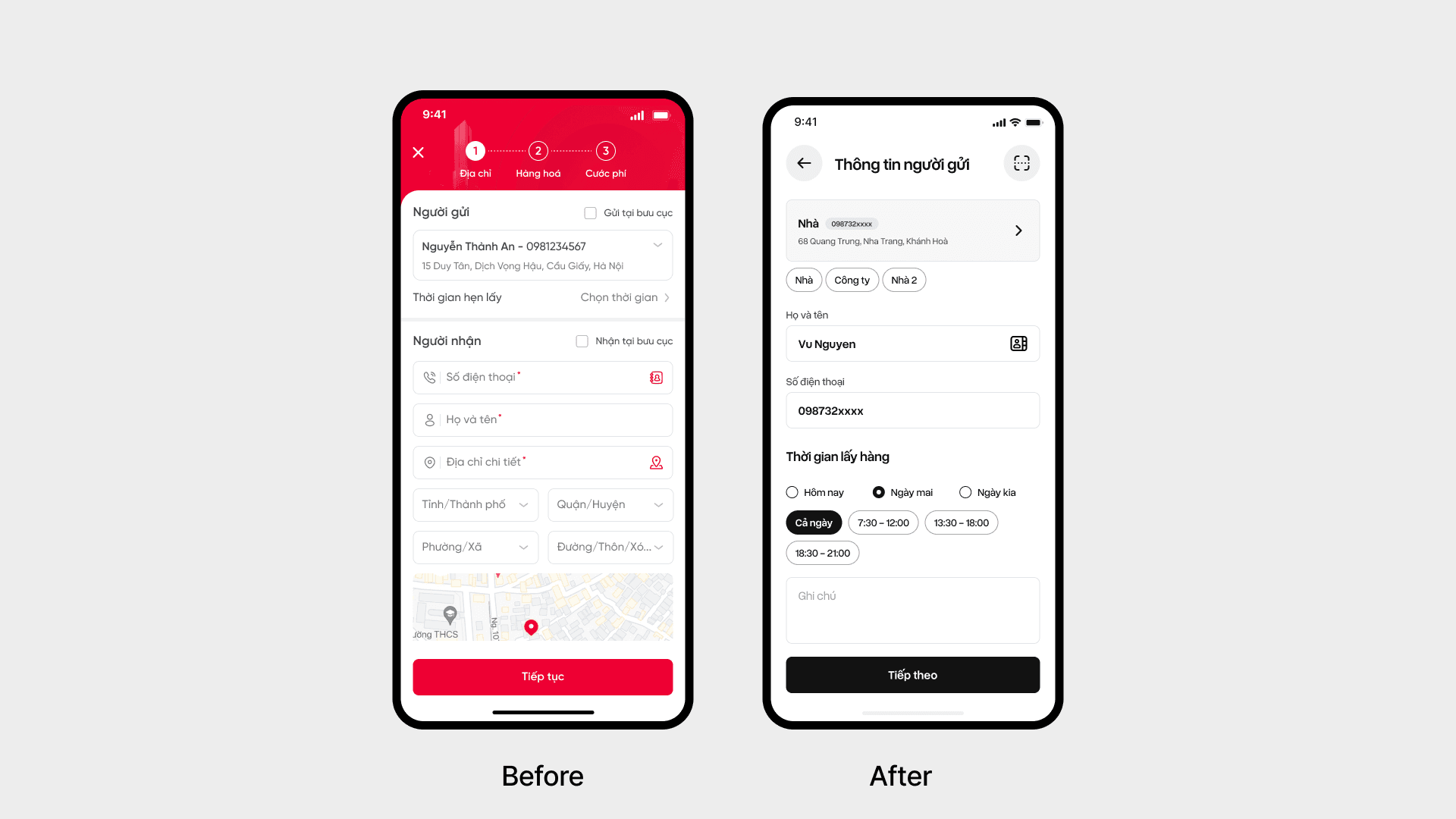
Ticket Creation Flow (My Primary Ownership)
Creating a delivery ticket is the most critical task in the app. The new flow accounts for three distinct states:
Guest users with no account yet
First time senders who just registered,
Returning users with existing tickets and saved addresses.
We applied progressive disclosure throughout: one task at a time, inputs revealed only when relevant, no overwhelming forms. This reduced cognitive load and cut down input errors on address heavy steps.
Guest users can build a ticket before being asked to register. This is especially important for first time users evaluating whether to switch platforms.
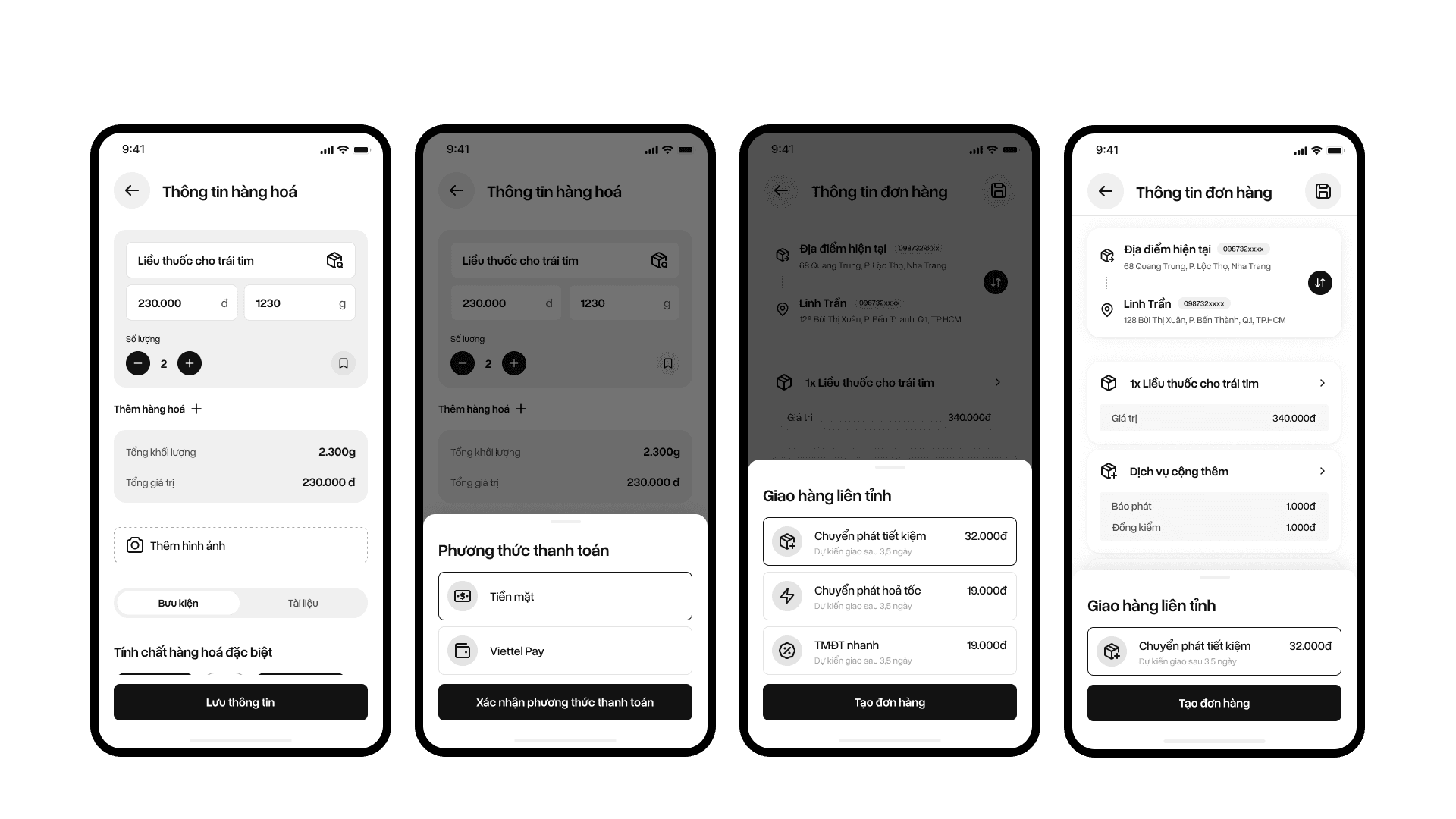
Other improvements
Saved addresses as tabs
Frequently used addresses surface as selectable tabs rather than buried inside a dropdown. Repeat bookings go from a search task to a single tap.
QR-Powered Fast Input
Sender and receiver information can be populated from a QR code, replacing manual entry for repeat use cases. Faster input, fewer address errors, better experience for SME users managing volume.
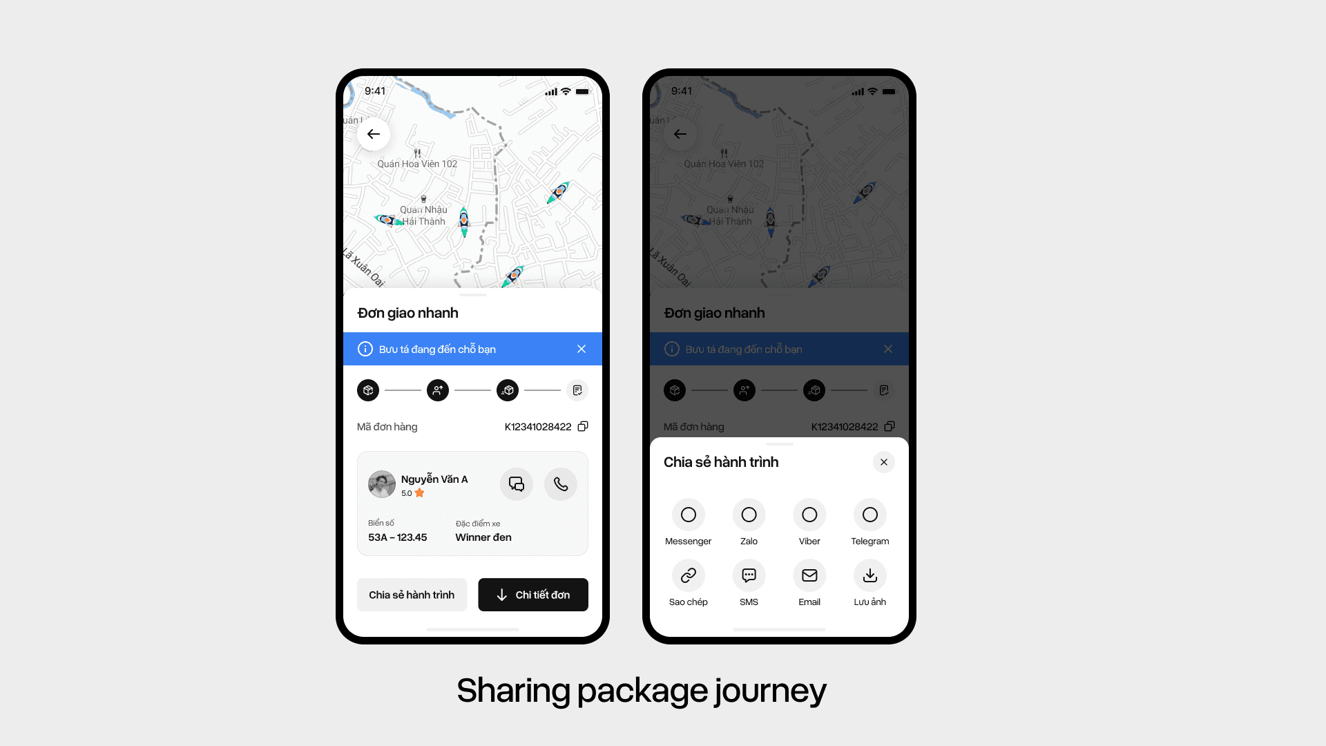
Package Journey Sharing
For same city deliveries, users can share a live tracking link with recipients. This directly addresses the most common support trigger "where is my package" before it becomes a support ticket.

Outcome
Successfully delivered Phase 1 within the one month deadline, giving Viettel Post a foundation to build subsequent phases on.
The new IA separated personal and SME flows, addressing the primary structural issue identified in research. High fidelity UI direction and component patterns from Phase 1 were carried directly into development phases without major revision.
Co-led a team of 6 designers through a rapid delivery cycle, maintaining design quality and consistency under tight constraints.
Takeaway
Speed and quality aren't opposites when the scope is honest. A constrained timeline forced sharp prioritization: fix the structure first, then the surface. The IA work was the highest leverage move because everything else including UI, flows, and component patterns depended on getting that right.